In the world of investing, numbers often dominate the conversation, yet beneath each percentage and price lies a visual story waiting to be told. By harnessing geometric forms—from graceful curves to nested rectangles—investors can unlock visual narratives of exponential growth that transform raw data into clear strategic insights. This guide explores how lines, areas, bars, bubbles, treemaps, and maps serve as metaphors and tools for illustrating investment trajectories, portfolio allocations, correlations, and global diversification.
Charting Parabolic Gains: The Power of Line and Area
Line charts, with their continuous curves, epitomize the notion of compounding in its purest form. When stock prices or portfolio values accelerate, they trace compounding curves of wealth accumulation that resemble elegant parabolas. Area charts extend this concept, filling the space beneath the line to convey the magnitude of cumulative growth—stacked areas can compare contributions from multiple assets, highlighting how each layer adds to overall gains.
Beyond simple trend analysis, these charts reveal turning points, plateaus, and momentum shifts, guiding decisions about buy, hold, or sell. A line that bends upward signals accelerating returns; a flattening curve may prompt risk reassessment. By animating or overlaying historical and projected lines, investors see both past performance and future forecasts as part of a single, unfolding story.
Mapping Hierarchies and Proportions: Treemaps and Heat Maps
Treemaps arrange nested rectangles to represent hierarchical asset allocations. Large blocks might signify major asset classes—equities, bonds, alternatives—while smaller rectangles within depict sector or regional breakdowns. This nested rectangles reveal layered returns approach helps investors spot concentration risks and diversification gaps at a glance.
Heat maps use color intensity across grids to illustrate correlations, trading volumes, or volatility levels. By shading sectors or factors according to performance metrics, one gains immediate awareness of areas generating the highest returns or carrying excessive risk.
- Quickly identify overweight positions in any sector or region.
- Spot clusters of high volatility before they impact the portfolio.
- Compare relative performance with intuitive color gradients.
Spotlighting Risk and Return: Scatter, Bubble, and Violin Plots
Scatter and bubble charts place individual investments on a two- or three-dimensional plane—risk on one axis, return on another, and market size or allocation size represented by circle diameter. These multidimensional scaling of investment data plots uncover correlations and outliers, revealing hidden trade-offs between volatility and reward.
For deeper distributional insights, violin or box plots depict the spread, skewness, and outliers of portfolio returns, highlighting periods of extreme performance or drawdowns. By visualizing the full distribution rather than just averages, investors develop a richer understanding of potential outcomes and tail risks.
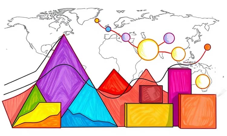
From Spatial to Global: Choropleth and Bubble Maps
Geographic visualizations bring a spatial dimension to asset allocation. Choropleth maps color-code regions by return rates or risk exposures, while bubble maps place scalable circles over countries or cities, indicating investment volume or market potential. These maps transform abstract diversification strategies into geometric perspectives on portfolio performance that resonate with both strategic planners and stakeholders.
In a globalized economy, recognizing growth hotspots—emerging markets, tech hubs, or resource-rich territories—can guide the next allocation shift. Real-time overlays of economic indicators, geopolitical events, and currency movements further enrich these spatial stories.
Practical Blueprint: Designing Your Financial Geometric Dashboard
Creating an effective dashboard requires thoughtful selection, arrangement, and interactivity. By combining multiple chart types, you craft a comprehensive view that balances depth and clarity. Here’s a checklist to get started:
- Choose charts that align geometry with your goals, such as curves for compounding and bubbles for multi-factor analysis.
- Maintain consistent color scales to prevent confusion across different visualizations.
- Incorporate interactive filters to drill into time frames, asset classes, or risk metrics.
- Annotate key inflection points with brief callouts rather than lengthy text.
- Ensure real-time data feeds for critical performance indicators and forecasts.
With these elements in place, your dashboard becomes an interactive charts for real-time insights hub, empowering you to make data-driven decisions with confidence and speed.
By framing financial data through geometric lenses, investors gain fresh perspectives on growth patterns, risk exposures, and diversification benefits. Each shape carries its own metaphor: lines that soar, areas that accumulate, bubbles that expand, and blocks that nest. Together, they form a visual language that speaks directly to the intuition, guiding both seasoned analysts and novice investors toward sharper, more confident decisions.
Embrace the geometry of gains, and let each curve, axis, and color gradient chart your journey toward financial success. With these visualization techniques, you transform static numbers into a dynamic story—one that not only informs but inspires.